They're a staple novelty at every tourist destination around the world. Do people actually use this item or is it just placed on a mantle? Maybe its in a cupboard for when house guests invade the home they can witness where you've travelled? The function of this item is pretty self-explanitory, with the only differences between each other being the exterior aesthetics, maybe even encompassing sculptural properties. However, signs abound with warnings and disclaimers describing this item as hazardous to a person's health. Why would someone purchase something fully aware of the risk it poses to the user's health?
The shot glass is a common item in every airport, hotel, and resort gift shop. What can possibly be so dangerous about a small, stout shot glass other than potentially shattering? The artwork on the exterior of these novelty shot glasses are created using lead based paint. Why? I have no idea. You would think that in this day and age an alternative choice to this harmful paint would be utilized but for some reason this lead based paint in used on a monumental scale. I haven't done too much traveling in my young age but from the locales I've travelled to, a good amount of these shot glasses are elaborately and colorfully adorned with this toxic substance.
I believe the manufacturers of these shot glasses are fully aware of the harm they can potentially cause in a future user of their product yet production continues without hesitation to cease assembly. I was even in the UC Davis bookstore and came across shot glasses with a sign warning the consumer of the lead paint included with the product as well as the side effects that can develop from its use.
A way to bypass the risk altogether is to just resist the urge to purchase this novelty. If worst comes to worst and you absolutely need to have this memento from the far away land you're visiting, purchase a shot glass with as little exterior paint as possible. Shot glasses that are engraved rather than painted reduce the risk of lead poisoning dramatically.
So please, drink responsibly.
Monday, November 29, 2010
Utopian Design
All design is meant to innovate what came before, right? The seemingly endless furniture of Ikea is meant to replicate the simplicity of classic Scandinavian designs. The ergonomic kitchenware in a house evolves from the basic tool designs from the stone age. What came before, in all regard of design, has now been altered for the better. Now there are several exceptions which encompass timeless capabilities, for example the wheel; the formula for which will always remain intact. We can thank the wheel, however, for a design which has yet to be placed into production but designs for which have been made public for years now.
The plans for a high-speed rail system between northern California and southern California is all but a realization of an inevitability if all the cards fall in all the right places. This form of transportation promises safe and efficient travel from the San Francisco Bay Area to Los Angeles in less than three hours. This train allows the population an alternative to flight and/or a tedious drive well over seven hours. A regular passenger train can be taken but would have to make stops along it's route, all along the while traveling at a far reduced speed compared to this high-speed train.
I remember walking from class to class at my junior college a couple years back and having spokespeople for this proposed idea stop me in my tracks and ask for donations to make this utopian dream become a reality. I have yet to hear anything in the news about construction commencing but the website provided, http://www.cahighspeedrail.ca.gov/, includes a plethora of information on the idea.
This high-speed rail would be a true utopian innovation in the world of design, allowing California to connect it's northern and southern regions in less than three hours. People frightened of flight and too impatient for a long car ride would deem this proposition a step in the right direction for uniting this golden state.
Sunday, November 28, 2010
Color: Sports Teams
Regardless of which sport is taken into account, a team's colors are what differentiate one from the other. These colors aren't arbitrarily chosen but actually meticulously decided upon in order to accentuate a team amongst it's competition. College sports are more color-heavy when using terms such as complimentary hues and whatnot. They're everywhere. The students and fans in the stands proudly exhibit their love for the team in effervescent tones all the while cheering until their voice-box explodes.
A school which comes to mind right away is the University of Florida, with the mascot being the Gators. Their primary color of royal blue is complimented by their secondary color of orange. Each color emphasizes the other to an astronomical effect. The hordes of orange and blue fans in the stands only reinforces the argument. The fact that the interior of the team's football stadium, nicknamed "The Swamp" is completely orange is not just to accentuate the secondary color, but on a bright sunny day, the orange facade of the stadium is complimented by the bluish hue of the sky.
Another team where complimentary colors are utilized is in the world of basketball. The Los Angeles Lakers' color scheme of purple and gold are another example of great design choice. This team, as well as the Gators, have been around for numerous decades and have stuck to their colors to prove that these complimentary themes are long-lasting.
Using the primary colors along with their compliments only accentuates that primary color further, allowing it to stand out even more so compared to a black or white compliment. These teams are only a brief sample of effective color schemes. Every sports team in the nation has their own identity involving their primary and secondary color, and more often than not the most successful themes get copied and duplicated. This only reinforces the idea that a successful color scheme can hopefully bring a team good fortune. Worst comes to worst, the team will at least look good losing.
Monday, November 15, 2010
The Ergonomics of Design: Xbox 360 Controller
Anyone who has worked in the retail industry is familiar with the saying, "the customer is always right." This phrase is synonymous with any business regardless of the target audience or demographic; whatever the customer wants, the customer gets. It's a simple concept whereas consumers have the ultimate say in how a company produces their certain product or service. In the world of ergonomics, the customer and/or user of the product rank number one. The comfort coupled with the overall functionality of the product, especially within the workplace, make for an inspiring design choice. Understanding and listening to the potential users enable a manufacturer to create not just what is wanted, but what is needed.
When Microsoft's Xbox first hit shelves in 2001, the controller(black) which accompanied the console was an absolute eyesore and way too robust to literally wrap both the user's hands around. When Microsoft released the Xbox's successor in 2005, the Xbox 360, the controller(white) corrected all that was wrong with it's predecessor. Gone was the outdated button layout and overall colossal-ness of the old controller, and in came a fresh new design which not only allows for complete functionality but incredible comfort for lengthy game sessions.
This product is incredibly safe. One hazard, and maybe the only hazard being that it's an electronic device, is the risk of electrocution, but I've never heard of such an occurrence. My controller in particular uses batteries as it's primary source of power, the battery cartridge is positioned in the rear of the controller, out of the way when in use by the player. Now unless the two AA batteries in the controller explode, I should be alright.
I can easily spend a couple hours in the video game world at a time. Anything longer than that, my eyes begin to get irritated, my foot may fall asleep, but never have my hands been affected from an extended amount of time playing video games. The controller is symmetrical in it's design with two equally contoured handles on either side, allowing for a decent grip on the controller with both hands regardless if the user is right-handed or a southpaw.
A good product design can only go so far, though. Using the product with ease is always wanted from a designer yet not always accomplished. In this case, despite the size of the hands of the user, the layout of the buttons and analog sticks are positioned in such a way where the thumbs and index fingers can reach them all without strain. Of course the effects the buttons have will vary with each game, but the layout of the controller remains the same, easy to use regardless of which game is in the console.
The Xbox 360 controller performs wonderfully. I have yet to have any problems with the one I currently own. However, my brother threw my other one in a bout of frustration and damaged the internal vibration device which rumbles corresponding to what happens within a game. But besides that event, the controller puts up with numerous hours of use without a sign of wear, except for maybe a few drops of perspiration from the user. Other than that, the 360 controller stands up to the competition making this controller the fan favorite among video game users.
The controller itself looks fantastic. The overall white scheme with silver/grey accents adds to its futuristic and modern style. The primary buttons of use are all color coordinated as well, utilizing the green(A), red(B), blue(X) and yellow(Y) hues to differentiate the buttons from any of their competitors.
The Xbox 360 controller incorporates functionality with incredible comfort allowing for endless hours of enjoyability. It's safe to say that Microsoft learned from what it did wrong with this controller's predecessor and corrected it substantially. This is a prime example of keeping the user in mind when designing a product for mass production, knowing that a wide variety of people will use this item, and satisfying every single one of them.
Wednesday, November 10, 2010
A's to San Jose?
The legitimacy of how true this concept may be is up for debate and the endless amounts of rumors which have been thrown around only lead to more loopholes. The reality of the Oakland Athletics major league baseball franchise moving to the south bay is the most concrete information known about the future of the team. I've heard that the team would move to Fremont several years ago but nothing has happened since then, and now as of late August the designs for a new stadium in San Jose have been leaked.
The plans for this new stadium are a major upgrade from the team's current ballpark, then again, a field similar to the one from Sandlot triumphs over the A's current concrete confines in Oakland. Alliteration aside, this stadium does a lot right, but also a lot wrong. The size alone of the stadium's plan is appropriate for the offerings of downtown San Jose, yet would be the smallest in all of baseball. The stadium is equally curvilinear as it is rectilinear. The curvature of the stadium accentuates the road below it, as well does the rectangular roofing does the outfield walls.
The color scheme amongst the stadium reflects that of the team itself, which is expected. The dark green of the bleachers and stands mirror the primary color of the team, while the relatively small third deck is of a yellow hue, contributing to the team's secondary color. The ballpark also incorporates a view to the outside world behind the centerfield fence, a feature definitely lacking at the coliseum in Oakland.
This stadium may be a step in the right direction for this franchise. While construction has yet to begin, being that these are only plans that have yet to be approved, this stadium is something to look forward to. Hopefully this will encourage fans to attend some games and support this team which has had abysmal attendance numbers for several years now. This stadium cannot be constructed soon enough, as Athletics fanatics are forever eager to once again root on their beloved ball club and return to national prominence.
Monday, November 8, 2010
Word & Image: What Will People Know?
A year ago at my junior college I was enrolled in a class that dealt with the technical aspect of Adobe Photoshop. I was a complete novice at the time, maybe working with photoshop for only a handful of weeks before this project was assigned. The instructor gave each student a song by Neil Young entitled "After the Garden". Utilizing a line from the song with an interpretation using image how we see fit, we had to describe what we heard. Being open-ended, I decided to think of how to encapsulate the song within an image. It wasn't easy.
The song basically discusses what life would be like after another war. A concept all too familiar amongst our nation. I began to brainstorm how exactly to capture the song. A ying-yang came to mind for some reason, a visual symbol of balance. The song deals with war and it's humble offerings as I tried to think of how a ying-yang can represent that with little success. The finished ying-yang came out well after superimposing the orange/red half onto a photograph of Earth. The left side is rifled with happiness and jubilation while the right side is at the complete opposite end of the spectrum, depicting scenes of terror and violence.
The phrase near the top of the image summarizes the collage. If the populace is aware of such evil throughout the world, then whey are we always so happy? We will not get brought down by the seemingly endless threat of diabolical schemes, we will become strong, as we have proven. We come together, as the left side depicts, countless ethnicities flood the page, all smiling. What will people know?
Word & Image: Children of Men
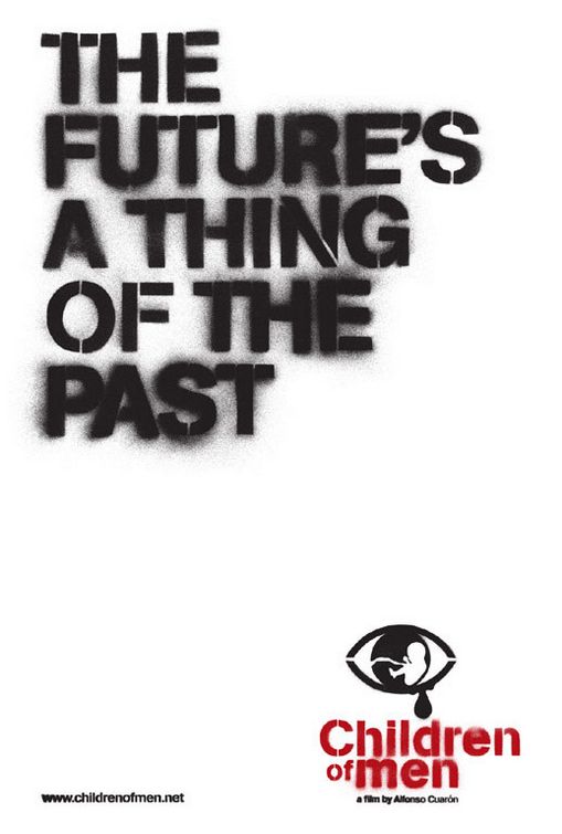
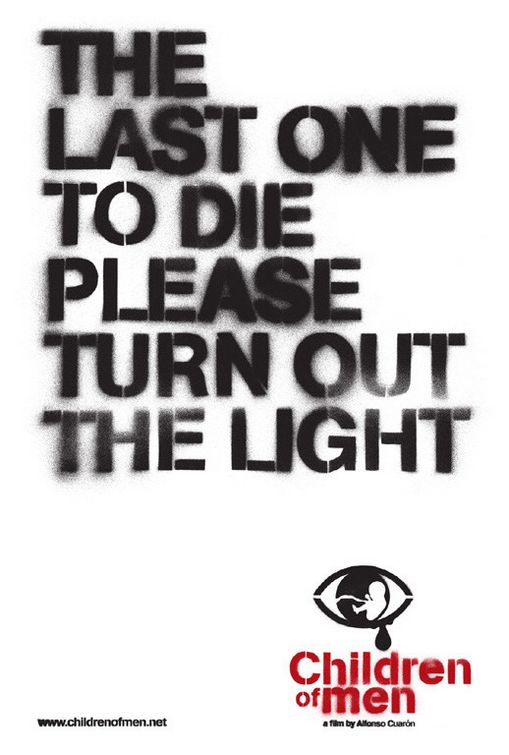
Arguably one of my favorite movies of all time, Children of Men encapsulates a reality without a future, literally. A child hasn't been born for almost two decades and humanity is beginning to lose hope, a concept which has eluded the world for far too long. This motion picture is an absolute masterpiece, winning numerous awards for it's breathtaking cinematography in 2007. Not only does the movie shine on the big screen, but so too does it's advertising/marketing campaign. I'm aware this will strike confusion in many since this movie is still flying under the radar. With that being said, how have it's promotional method been so successful?
I remember watching the trailer for Children of Men in the theaters and was immediately anticipating it's release. I also recall noticing promotional materials, such as billboards and posters, beginning to populate urban areas. They aren't difficult to miss with such taglines as, "The future's a thing of the past" and "The last one to die please turn out the light". These advertisements utilized completely white backgrounds with unkempt, stenciled lettering, most likely to give the effect of spray painted graffiti. The title of the movie in the bottom right of the posters incorporates a similar font, keeping true to the relationship between the taglines and the overall dark theme of the film.
This marketing strategy is risky, relying heavily on a simple phrase to put people in the theaters. Not only do the tones of the phrases make you think, but the font also evokes a sense of disturbance where the only available answer lies in actually viewing a screening, or having a friend give you a synopsis, but where's the fun in that?
Children of Men is a film of hope, yet you might not be able to tell from the posters. However, the posters are what put people in the seats. It worked on me.
Saturday, November 6, 2010
Deep in the Woods
The University of Oregon has a reputation for outlandish design, I think a couple years back the football team had ten different variations of their on-field jersey, some hits, some misses. Jerseys are one thing, they're worn for a few hours then placed back into circulation until they need to be worn next, maybe never worn again at all. Their basketball jerseys aren't nearly as loud as their football counterparts, but that may be because the basketball court itself may take the shine away from the jerseys.
The new basketball court design is unlike anything ever witnessed before. Traditionalists may not like this new rendition but those from the pacific northwest will. The new court design emphasizes the lush forests of the region, as well as paying homage to Oregon's lone 1939 championship basketball team, back then nicknamed "The Tall Firs".
Oregon fans and players will revel in the addition of this court as their now iconic home turf while opposing teams and players may find new reasons to fear this team, especially with this elaborate flooring. The tagline "Deep in the Woods" rests underneath the school's main athletic logo while the tall firs crowd the outer perimeter of the entire court, only making space for the center of the court, where the main logo is most legible.
The colors of Oregon are green and gold, yet the color pallet chosen for the floor's design do not resemble any familiar hues of any of the school's sports teams, rather the floor resembles the region which the school is situated. The originality of this design is straight awe-inspiring. However, only time will tell if Oregon basketball will reign supreme amongst the nation, because their arena floor definitely will.
Monday, November 1, 2010
Kinetic Typography
The concept of kinetic typography is unique. Imagine a monologue from your favorite movie. Remove the visuals but keep the audio. Insert type where the visuals once were, moving and shifting across the screen. This coming together of motion graphics and type is known as kinetic typography, a phenomenon which I have only recently discovered yet cannot get enough of.
The ability to manipulate font and text eludes to an entirely new way to view scenes, speeches, and even music videos. I've easily viewed dozens of these creations, all disparate. Each video puts a completely different spin on an overly-watched scene, for example from "It's Always Sunny in Philadelphia" below.
I love working with type. I can spend hours in Adobe Illustrator meticulously choosing fonts and arranging letters until satisfied. Kinetic Typography allows these creations to come to life. I have yet to produce one of these videos but will soon try since I know of many monologues where kinetic typography will only enhance an otherwise immaculate scene.
These concoctions are fun to watch. To see the type dance around the screen is unlike anything else. Type isn't the only ingredient in these videos, however. Images can be placed at certain points during the speech for emphasis or to just switch things up a bit. Whatever the case may be, I highly recommend checking out your favorite feature film monologues on youtube by typing in the movie title followed by "kinetic typography". Chances are that somebody, somewhere, has done it.
Gillette Fusion
What induces brand loyalty? Does the reputation of a product coincide with its design and functionality? Consumers need that which serves a purpose, and they want what they necessarily do not need, for leisure, for instance. Some companies urge to focus on one of these aspects yet the successful ones focus on both, achieving loyalty from consumers just by doing their job. By creating an immaculate product where form and function adhere to one another, brand loyalty is automatic.
The Gillette Fusion razor is a product where my loyalty rests. I started shaving some years ago and didn't really have a preference in a specific brand, just as long as it got the job done. I would sift through the disposables and even use my older brother's without his knowledge. I watched a commercial of the Gillette Fusion a while back and figured I need to make an upgrade, and possibly have a razor I can call my own.
The chrome finish with vivid royal blue rubber grips placed conveniently along the handle allow for increased comfort compared to the plastic disposables. Orange accents also highlight the brand's color scheme on the object, utilizing the blue's compliment. The blue grips are soft and enable my fingers to rest along the handle with comfort. Also, the weight of the razor adds to the durability which it promises. I've had the same razor for years, of course switching out the blades when needed with a conveniently placed 'release' button which releases the blades from the handle, literally popping the blades off the handle and into the trash bin.
This razor has been a great investment and proved the statement, 'you get what you pay for'. The Gillette company designed this product with the consumer in mind, with me in mind; and it's very much appreciated.
Friday, October 29, 2010
Objectified
Design is everywhere regardless if we're aware or not. Every individual object we use in our life goes through an intense process to evolve from idea to the eventual actualization. This is what designers strive for and ultimately why they become designers in the first place. In this case, from the film Objectified, the design process for numerous objects in the world is glorified and made apparent to the audience. Instead of taking a look at the finished project which we're all familiar with and accustomed to using, the film instead goes behind the scenes and discusses in detail why designers take the route they do in creating these popular objects.
A prevalent concept I noticed while watching this film was the heavy reliance on the user/consumer which assists in steering the design in the appropriate direction towards mass production. A design will not be finalized until unanimity is attained from the people involved in the design and an overall consensus is reached among users of the eventual product. A example was the grip for the peeler. The design team responsible sifted through countless prototypes until one was found by accident, in which a bicycle grip created the inspiration for their ideal design.
While watching, another striking concept came to mind. There were several scenes in which machines were crafting the objects into their desired form, shape, etc. Now don't those machines which create the product have to be designed themselves? I mean, these machines are designed to make other designs come to life. It's almost astonishing how these mechanical building blocks are overlooked in the design process and don't recall this process being discussed in great detail.
This film allowed the viewer into the heads of the designers; to witness what made them tick. Whether our future fields are industrial design, graphic design, fashion design and so on and so forth, Objectified enabled us, as potential designers, to discover what awaits after graduation.
Monday, October 18, 2010
Bigger is better?
Misplacing a television remote control can arguably be the most frustrating occurrence in one's life. Traffic can be pretty bad, as well as a person's favorite sports team missing the playoffs for twenty consecutive years, but losing a television remote might top the list. This little device sneaks into the tightest of crevices, the darkest reaches of the household, and even the bathroom for an occasional vacation to escape the mediocrity of the living room. There is now a solution to this global phenomenon to hopefully bolster its acceptance into the living rooms of families worldwide.
The Sentry RMC10 Really Big Universal Remote is the answer. This colossal device is ideal for those who avidly misplace important items or those who live in Texas. Anyways, this remote encompasses large, easy-to-read buttons with a simple design to ensure that the owner is able to place this remote throughout the house without having to worry about where it can possibly be hiding.
This device adds the allure of a novelty item as well, contributing with it's outlandish size compared to the basic size of a remote one would receive with the purchase of a new television set. I've had a chance to hold this mammoth remote in both hands. There is no possible way an individual can use every button of this remote with just one hand, it definitely requires two in order to utilize its full potential.
This item is also ideal for the elderly. This remote is an example where form and function coincide with each other, allowing those with troubling sight to navigate the remote with little hassle. This remote, as basic a design and concept as it is, revolutionizes the genre of remote controls, placing it into a category all by its lonesome; a category of greatness.
Thursday, October 14, 2010
Compare/Contrast
The Golden State Warriors of the NBA have fallen on tough times the last few years. They've exhibited promise with a helpful slew of rookies and young talent mixed with seasoned veterans, however finding that recipe for success has been nowhere near their kitchen. The Warriors earned a postseason berth as recent as 2007 but that has been the lone bright spot for well over a decade. A change is needed to spruce things up, maybe steer this bewildered franchise in the right direction.
Altering the look of a major sports franchise isn't an easy task and takes tremendous cooperation. The Tampa Bay Rays of the MLB changed their appearance and made it to the World Series a couple years later. The Golden State Warriors are hoping for a similar story by changing their logo and color scheme for the upcoming 2010-2011 season.
The new logo emphasizes simplicity. A bold two color scheme with the royal blue and yellow compared to the several shades of blue from the old design, including the gradient of orange/yellow within the 'Warriors' text. The bridge in the new design isn't that of the infamous Golden Gate Bridge, but that of the Bay Bridge which connects the cities of Oakland and San Francisco. Why the Bay Bridge instead of one known worldwide? The Warriors relocated from Philadelphia to San Francisco in 1962. In 1971, the team played their home games in Oakland, where they still reside today, hence the addition of the Bay Bridge into the new, revamped logo.
The Warriors have also reverted from the lightning bolt design and nixed their mascot 'Thunder' due to another team relocating and changing their name to the Thunder, now in Oklahoma City. The new design is lacking any affiliation with basketball, however. The old logo included a basketball as the background of the image to group the logo together and center the mascot and name. There are alternatives to the new logo though which do include the white seams of a basketball that will be used on occasion. This move to simplicity is hopefully the right direction for this sinking ship of a franchise, only time will tell.
Design is Conversation
Nobody likes obstacles. Especially if someone is in a hurry to get somewhere, an obstacle only impedes their progress. How about walls? They evoke the same feeling, right? The Berlin Wall separated a nation for quite some time until torn down by the masses. Aren't barriers in the same category as obstacles and walls? I can't speak for everybody on this topic but am almost certain that nobody appreciates these three unless purposefully in the search for adversity. Barriers are tough, especially when communicating between distant populations. Design assists in breaking down this barrier once and for all.
Successfully mastering a completely different language is arguably one of the most difficult feats to accomplish. I attempted learning spanish some years ago while in school but to avail. I can only imagine how difficult navigating another nation's city must be regardless of the locale. However, with the use of iconography, this once treacherous task is now made easier. The use of icons can be found in any major city and civilization across the globe.
Some of the most common icons used in most metropolitan areas are the airplane for an airport, an 'H' or an equidistant cross for a hospital, and a boat anchor for a dock or a port. These assist the average traveller in navigating oneself through the blockade of the language barrier. Even so, icons aren't just used for foreigners. Posted up on the sides of every highway in America and perhaps throughout the world, are more universal icons which can guide travelers to useful locations. Some examples of these icons are a gas pump for a gas station, basic kitchen utensils for dining, and a bed for hospitality.
Now these icons aren't extravagant designs. They are in their most basic and simplified form in order to catch the eye of the viewer in short notice and allow the viewer to recognize what the icon represents right away. These icons allow communication between distinct cultures without the urge or necessity to utter a single word. Instead, a simple road sign works just fluently.
Monday, October 11, 2010
Pepsi vs. Coca-Cola
I honestly cannot tell the difference. Cola is cola. I'm sure millions have partaken in the infamous taste test which clouded the media some years ago. Do you have a preference? You probably do, maybe just having a biased opinion on what your family grew up drinking, or maybe your decision is based on the can design. Is that really a factor though? Can the specific logo, design, and/or marketing of a certain brand triumph over another so far as nullifying which product tastes better?
The answer is yes. Let's start simple and look at the colors of each company. Pepsi seems like the patriotic choice with its red, white, and blue logo, while Coca-Cola seems to contribute with a two color scheme of red and white. Both cans are saturated with their company's primary color which alludes to the notion of good versus evil. This may be too farfetched but blue and red usually coincide with good and evil, respectively. Countless examples include Heaven vs. Hell, Yankees vs. Red Sox and even the United Nations vs. the Third Reich. The third example may be exaggerating a bit but the point has been made. Now I highly doubt Coca-Cola has any plans for world domination but I'm not ruling anything out. However, there's nothing out of the ordinary here and if you think about it, a total of three colors are used between the two companies so it's debatable whether color has any actual significance in choosing one over the other.
The font of each company's design may play a bit more of a factor than the colors. Coca-Cola utilizes a cursive script with an exaggerated height of the letters which are accentuated by the curve of the can and/or bottle. Pepsi emphasizes simplicity with its sans serif, lowercase font. The strictly lower case font has been catching fame and recognition with modern designers across the nation, an example being the logo for Citibank and AT&T. This shift towards simplicity and a more modern look would seem to place Pepsi ahead of Coca-Cola in appealing to a younger demographic. Coca-Cola, by contrast, would mostly be favored by those who appreciate tradition and durability, characteristics of their formal text; something the Coca-Cola brand has on their side.
Furthermore, do color and font have a significant say in who drinks which cola? Maybe, maybe not. It's forever up for debate. It's honestly up to the consumers themselves. A preference is just that, a preference. The decision isn't definite, or else that preference would turn into a certainty, something Pepsi and Coca-Cola have been vying for from customers for over a century.
Saturday, October 9, 2010
Creation From Without
What is perfection? How can one define what is perfect compared to imperfect? Who decides? Does a decision require unanimity? This concept of absolute perfection can entirely be based on opinion yet arguments will abound that characterizing something as 'perfect' will always depend on the canon, medium, and intentions of the artist. Many will believe this to be a load of malarkey, yet I'm quite sure the Greeks have no problem converting any doubters.
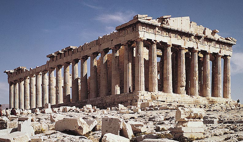
The Parthenon is an absolute marvel of marble and mathematics. Alliteration aside, this temple atop the Acropolis in Athens, Greece is as close to perfection as anything in this world. One cannot take a stroll in any major city without noticing countless resemblances and hints of influence from this remarkable structure. Our nation's capital, Washington DC, is a prime example of utilizing the architectural design of the Parthenon. The Lincoln Memorial and the Supreme Court are probably the most recognizable of the buildings which draw influence from Greece's most famous building.
The concepts introduced by the Greek architects have been reproduced the world over. Emulating this structure isn't by lack of originality by modern designers, but more of a symbol of honor and dedication to the ones who revolutionized architecture. I highly doubt an individual looks upon a building or facade built to replicate that of the Parthenon and determines it unsatisfactory.
The Parthenon doesn't just symbolize perfection, but also durability, power, and strength. When looked upon from ground level, an individual cannot help but become overwhelmed with awe. This is what designers attempt to accomplish, and with the help of the Greeks, this once unattainable level of perfection is now possible.
Thursday, October 7, 2010
Stone Soup
I grabbed paper plates from my kitchen cupboard, a roll of scotch tape, a package of colored pencils, and a pair of scissors. The concept of "Stone Soup" was foreign before this past Tuesday's class. The one thing I knew was that I wouldn't be the only one faced with this task of creating something from nothing. My hopes for a successful project relied on the thoughts and awareness of my peers to bring objects and art supplies which can be manipulated at will.
I'll say this right now, my mentor and my group came through in the clutch with an outstanding idea which seemed to distinguish our creation with those of the other groups. Francois is his name. A shy guy known for a divine pallet of fine wine and the arts. His "Honest Abe" mentality allows him to be regarded as a man who knows what he's talking about without any doubt in the air. However, we find him on this bench, endlessly waiting for a date who never shows.
Each student in the group piled their materials and equipment together in order to derive any thought on possibly how to tackle this task. We used the process of 'looking' to visually identify which materials would prove the most useful. We had plenty of tools to create with, including several boxes which were perfect for Francois' chest, torso, and legs. With the addition of colored construction paper, we were able to create clothing for this naked man. After all, he is supposedly going on a date.
We also looked to the surrounding environment for assistance. We found several decently sized fallen limbs from the abundance of trees which were utilized for his arms and legs. Construction paper was also used for this shoes and wrapped around the sticks to resemble skin. The face was created using a paper plate, portions of an egg carton, wire, yarn, and an exaggerated top hat. He seemed to steal the show, as many students felt the urge to take a photograph with this lonely man, waiting for a date who never arrives.
Monday, October 4, 2010
Whatever Will Be, Will Be.
Where do art and design meet in the grand scheme of things? Are they at complete opposite ends of the spectrum or frolicking hand-in-hand through fields of dandelions? Does design strictly have to dwell in the realm of visuals or can design, like art, have a much broader scope involving endless amounts of media? Several months ago I stumbled upon a song which defies the rules that we're accustomed to following in regards to music. The song is "Que Sera" by the artist Wax Tailor.
I've never heard of this artist before hearing this song, yet soon realized it's something unlike I've ever heard before and pretty sure it's safe to say not too many people are familiar with this artist, especially the ones who are saturated with the mainstream. Wax Tailor is an artist who takes fragments of speech and instrumentals and mixes the two together with surprising results. My mother even listened to it and recognized several of the soundbites from movies and songs while she was growing up.
This artist's ability to utilize these quotes outside of their original context, especially most decades later, while introducing them to a the media of music, is a testament to the artist's talent. A quite noticeable voice in the song is that of Doris Day, whose line from the song "Que Sera" loops as the chorus and can be heard in the background continuously. This ability of the artist to take something from the past and manipulate it in such a way where it still holds recognition yet compounded with his own musical talents, creates something new, fresh, and memorable.
Now where does design play a role? Many if not all designers rely heavily on the past work of previous artists for inspiration. True creativity, making something from nothing, is a very difficult task regardless of the subject matter. In this case, Wax Tailor created his own sound by simultaneously relying upon the work of others. This concept of looking to others for inspiration plays a large part in the world of design, regardless of the emphasis of the designer.
A Comic Book About Comic Books
When I first understood the concept behind Scott McCloud's Understanding Comics I immediately thought of an episode of "Seinfeld" where the character of Kramer publishes a coffee table book about coffee tables. Kramer's book did exactly what it set out to do, inform the likes of you and me about the coffee tables of the rich and famous while providing a centerpiece to the dull and lifeless table which inhabit most living rooms. Scott McCloud's book is extremely unique by not only following the same formula as Kramer's masterpiece, but also succeeding along the way.
Understanding Comics allows the reader to grasp the concepts laid out by McCloud by reading, but more importantly being a student of design, by visually displaying tremendous amounts of examples utilizing the very techniques which he is teaching. This book is fun to read which I rarely say but am proud to mention every time I cross paths with a piece of literature, in this case a comic book, whereas I enjoy the reading process.
The abundance of humor ties in with the concepts he successfully attempts to portray. The simplicity of the book allows for even the most stubborn of readers to sit down and actually enjoy. Only a few moments come to mind where rereading was necessary, but excluding those instances, the entire book was a breeze.
Even though this book primarily dives into the world of comics, the ideas can be employed in numerous facets of design. The idea regarding a simple line or technicality of a shape having the power to induce the reader or target audience to feel a certain emotion is rather remarkable. It's compelling how something so small and minute as a single line can have such a profound impact.
Sunday, October 3, 2010
The Man of a Thousand Locales
He is everywhere. He is nowhere. His stagnant glare is forever looking back at you from the shadows. It's difficult to fathom this one man can wear a single outfit for an entire lifetime yet be incredibly difficult to spot in a crowd. One would think that being fully aware of this man's wardrobe, color combination, and accessories would give someone the upper hand in determining his whereabouts. His willpower to remain hidden and out of plain sight severely outweighs the focus and perseverance of the one's who wish to sniff the breadcrumbs he lays down behind. This man lacking a last name has travelled to more locations and eras in time than Doc Brown and his famed Delorean. Who can he be? More importantly however, where is he?
When I first opened a book from Martin Handford's "Where's Waldo?" series well over a decade ago, I was instantly awe-struck. I remember not being able to focus on a single illustration since my eyes were constantly wandering. The concept of looking for this random man in this random setting with hundreds if not thousands of random 'decoys' engaged in random acts was nothing short of mind boggling. I cannot emphasize enough how much time I'd spend attempting to distinguish him from the hordes of lookalikes.
The oversized pages allowed for the attention to detail to stand out incredibly. Each illustration had their own characteristics which separated them from the previous page, this also includes how each and every one of the figures stood out from one another without seeming monotonous or half-assed by the author. This reinforced the fact that a concept as difficult as finding a needle in a stack of needles can be simplified by searching for the red and white hues of a horizontally striped sweater. Amidst the similarly colored backgrounds, foregrounds, and also the clothing of the 'decoys', successfully locating Waldo is no easy feat.
Martin Handford made it possible to notice the little things, literally. Wherever my eyes made contact, I remained entertained regardless if Waldo was anywhere nearby. The "Where's Waldo?" series isn't just about finding this now iconic man, but also about noticing and appreciating the world around him.
Subscribe to:
Posts (Atom)