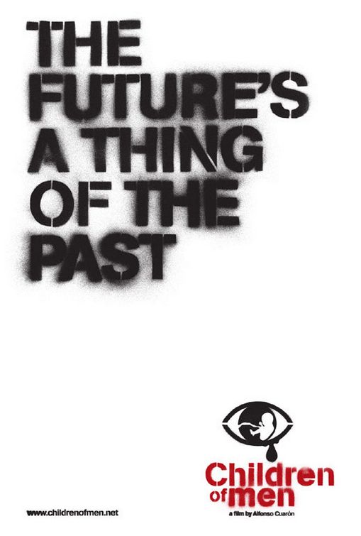
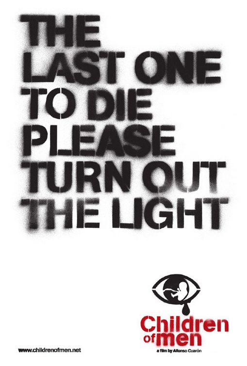
I remember watching the trailer for Children of Men in the theaters and was immediately anticipating it's release. I also recall noticing promotional materials, such as billboards and posters, beginning to populate urban areas. They aren't difficult to miss with such taglines as, "The future's a thing of the past" and "The last one to die please turn out the light". These advertisements utilized completely white backgrounds with unkempt, stenciled lettering, most likely to give the effect of spray painted graffiti. The title of the movie in the bottom right of the posters incorporates a similar font, keeping true to the relationship between the taglines and the overall dark theme of the film.
This marketing strategy is risky, relying heavily on a simple phrase to put people in the theaters. Not only do the tones of the phrases make you think, but the font also evokes a sense of disturbance where the only available answer lies in actually viewing a screening, or having a friend give you a synopsis, but where's the fun in that?
Children of Men is a film of hope, yet you might not be able to tell from the posters. However, the posters are what put people in the seats. It worked on me.
No comments:
Post a Comment