Friday, October 29, 2010

Objectified

Design is everywhere regardless if we're aware or not. Every individual object we use in our life goes through an intense process to evolve from idea to the eventual actualization. This is what designers strive for and ultimately why they become designers in the first place. In this case, from the film Objectified, the design process for numerous objects in the world is glorified and made apparent to the audience. Instead of taking a look at the finished project which we're all familiar with and accustomed to using, the film instead goes behind the scenes and discusses in detail why designers take the route they do in creating these popular objects.

A prevalent concept I noticed while watching this film was the heavy reliance on the user/consumer which assists in steering the design in the appropriate direction towards mass production. A design will not be finalized until unanimity is attained from the people involved in the design and an overall consensus is reached among users of the eventual product. A example was the grip for the peeler. The design team responsible sifted through countless prototypes until one was found by accident, in which a bicycle grip created the inspiration for their ideal design.

While watching, another striking concept came to mind. There were several scenes in which machines were crafting the objects into their desired form, shape, etc. Now don't those machines which create the product have to be designed themselves? I mean, these machines are designed to make other designs come to life. It's almost astonishing how these mechanical building blocks are overlooked in the design process and don't recall this process being discussed in great detail.

This film allowed the viewer into the heads of the designers; to witness what made them tick. Whether our future fields are industrial design, graphic design, fashion design and so on and so forth, Objectified enabled us, as potential designers, to discover what awaits after graduation.

Monday, October 18, 2010

Bigger is better?

Misplacing a television remote control can arguably be the most frustrating occurrence in one's life. Traffic can be pretty bad, as well as a person's favorite sports team missing the playoffs for twenty consecutive years, but losing a television remote might top the list. This little device sneaks into the tightest of crevices, the darkest reaches of the household, and even the bathroom for an occasional vacation to escape the mediocrity of the living room. There is now a solution to this global phenomenon to hopefully bolster its acceptance into the living rooms of families worldwide.

The Sentry RMC10 Really Big Universal Remote is the answer. This colossal device is ideal for those who avidly misplace important items or those who live in Texas. Anyways, this remote encompasses large, easy-to-read buttons with a simple design to ensure that the owner is able to place this remote throughout the house without having to worry about where it can possibly be hiding.

This device adds the allure of a novelty item as well, contributing with it's outlandish size compared to the basic size of a remote one would receive with the purchase of a new television set. I've had a chance to hold this mammoth remote in both hands. There is no possible way an individual can use every button of this remote with just one hand, it definitely requires two in order to utilize its full potential.

This item is also ideal for the elderly. This remote is an example where form and function coincide with each other, allowing those with troubling sight to navigate the remote with little hassle. This remote, as basic a design and concept as it is, revolutionizes the genre of remote controls, placing it into a category all by its lonesome; a category of greatness.

Thursday, October 14, 2010

Compare/Contrast

The Golden State Warriors of the NBA have fallen on tough times the last few years. They've exhibited promise with a helpful slew of rookies and young talent mixed with seasoned veterans, however finding that recipe for success has been nowhere near their kitchen. The Warriors earned a postseason berth as recent as 2007 but that has been the lone bright spot for well over a decade. A change is needed to spruce things up, maybe steer this bewildered franchise in the right direction.

Altering the look of a major sports franchise isn't an easy task and takes tremendous cooperation. The Tampa Bay Rays of the MLB changed their appearance and made it to the World Series a couple years later. The Golden State Warriors are hoping for a similar story by changing their logo and color scheme for the upcoming 2010-2011 season.

The new logo emphasizes simplicity. A bold two color scheme with the royal blue and yellow compared to the several shades of blue from the old design, including the gradient of orange/yellow within the 'Warriors' text. The bridge in the new design isn't that of the infamous Golden Gate Bridge, but that of the Bay Bridge which connects the cities of Oakland and San Francisco. Why the Bay Bridge instead of one known worldwide? The Warriors relocated from Philadelphia to San Francisco in 1962. In 1971, the team played their home games in Oakland, where they still reside today, hence the addition of the Bay Bridge into the new, revamped logo.

The Warriors have also reverted from the lightning bolt design and nixed their mascot 'Thunder' due to another team relocating and changing their name to the Thunder, now in Oklahoma City. The new design is lacking any affiliation with basketball, however. The old logo included a basketball as the background of the image to group the logo together and center the mascot and name. There are alternatives to the new logo though which do include the white seams of a basketball that will be used on occasion. This move to simplicity is hopefully the right direction for this sinking ship of a franchise, only time will tell.

Design is Conversation

Nobody likes obstacles. Especially if someone is in a hurry to get somewhere, an obstacle only impedes their progress. How about walls? They evoke the same feeling, right? The Berlin Wall separated a nation for quite some time until torn down by the masses. Aren't barriers in the same category as obstacles and walls? I can't speak for everybody on this topic but am almost certain that nobody appreciates these three unless purposefully in the search for adversity. Barriers are tough, especially when communicating between distant populations. Design assists in breaking down this barrier once and for all.

Successfully mastering a completely different language is arguably one of the most difficult feats to accomplish. I attempted learning spanish some years ago while in school but to avail. I can only imagine how difficult navigating another nation's city must be regardless of the locale. However, with the use of iconography, this once treacherous task is now made easier. The use of icons can be found in any major city and civilization across the globe.

Some of the most common icons used in most metropolitan areas are the airplane for an airport, an 'H' or an equidistant cross for a hospital, and a boat anchor for a dock or a port. These assist the average traveller in navigating oneself through the blockade of the language barrier. Even so, icons aren't just used for foreigners. Posted up on the sides of every highway in America and perhaps throughout the world, are more universal icons which can guide travelers to useful locations. Some examples of these icons are a gas pump for a gas station, basic kitchen utensils for dining, and a bed for hospitality.

Now these icons aren't extravagant designs. They are in their most basic and simplified form in order to catch the eye of the viewer in short notice and allow the viewer to recognize what the icon represents right away. These icons allow communication between distinct cultures without the urge or necessity to utter a single word. Instead, a simple road sign works just fluently.

Monday, October 11, 2010

Pepsi vs. Coca-Cola

I honestly cannot tell the difference. Cola is cola. I'm sure millions have partaken in the infamous taste test which clouded the media some years ago. Do you have a preference? You probably do, maybe just having a biased opinion on what your family grew up drinking, or maybe your decision is based on the can design. Is that really a factor though? Can the specific logo, design, and/or marketing of a certain brand triumph over another so far as nullifying which product tastes better?

The answer is yes. Let's start simple and look at the colors of each company. Pepsi seems like the patriotic choice with its red, white, and blue logo, while Coca-Cola seems to contribute with a two color scheme of red and white. Both cans are saturated with their company's primary color which alludes to the notion of good versus evil. This may be too farfetched but blue and red usually coincide with good and evil, respectively. Countless examples include Heaven vs. Hell, Yankees vs. Red Sox and even the United Nations vs. the Third Reich. The third example may be exaggerating a bit but the point has been made. Now I highly doubt Coca-Cola has any plans for world domination but I'm not ruling anything out. However, there's nothing out of the ordinary here and if you think about it, a total of three colors are used between the two companies so it's debatable whether color has any actual significance in choosing one over the other.

The font of each company's design may play a bit more of a factor than the colors. Coca-Cola utilizes a cursive script with an exaggerated height of the letters which are accentuated by the curve of the can and/or bottle. Pepsi emphasizes simplicity with its sans serif, lowercase font. The strictly lower case font has been catching fame and recognition with modern designers across the nation, an example being the logo for Citibank and AT&T. This shift towards simplicity and a more modern look would seem to place Pepsi ahead of Coca-Cola in appealing to a younger demographic. Coca-Cola, by contrast, would mostly be favored by those who appreciate tradition and durability, characteristics of their formal text; something the Coca-Cola brand has on their side.

Furthermore, do color and font have a significant say in who drinks which cola? Maybe, maybe not. It's forever up for debate. It's honestly up to the consumers themselves. A preference is just that, a preference. The decision isn't definite, or else that preference would turn into a certainty, something Pepsi and Coca-Cola have been vying for from customers for over a century.

Saturday, October 9, 2010

Creation From Without

What is perfection? How can one define what is perfect compared to imperfect? Who decides? Does a decision require unanimity? This concept of absolute perfection can entirely be based on opinion yet arguments will abound that characterizing something as 'perfect' will always depend on the canon, medium, and intentions of the artist. Many will believe this to be a load of malarkey, yet I'm quite sure the Greeks have no problem converting any doubters.

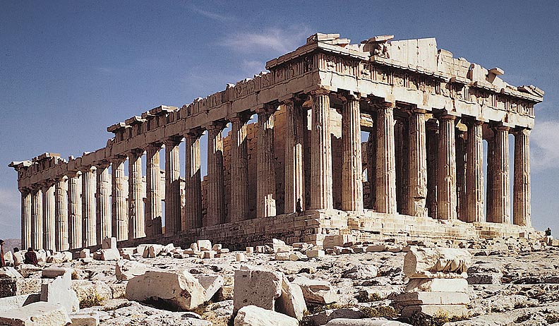
The Parthenon is an absolute marvel of marble and mathematics. Alliteration aside, this temple atop the Acropolis in Athens, Greece is as close to perfection as anything in this world. One cannot take a stroll in any major city without noticing countless resemblances and hints of influence from this remarkable structure. Our nation's capital, Washington DC, is a prime example of utilizing the architectural design of the Parthenon. The Lincoln Memorial and the Supreme Court are probably the most recognizable of the buildings which draw influence from Greece's most famous building.

The concepts introduced by the Greek architects have been reproduced the world over. Emulating this structure isn't by lack of originality by modern designers, but more of a symbol of honor and dedication to the ones who revolutionized architecture. I highly doubt an individual looks upon a building or facade built to replicate that of the Parthenon and determines it unsatisfactory.

The Parthenon doesn't just symbolize perfection, but also durability, power, and strength. When looked upon from ground level, an individual cannot help but become overwhelmed with awe. This is what designers attempt to accomplish, and with the help of the Greeks, this once unattainable level of perfection is now possible.

Thursday, October 7, 2010

Stone Soup

I grabbed paper plates from my kitchen cupboard, a roll of scotch tape, a package of colored pencils, and a pair of scissors. The concept of "Stone Soup" was foreign before this past Tuesday's class. The one thing I knew was that I wouldn't be the only one faced with this task of creating something from nothing. My hopes for a successful project relied on the thoughts and awareness of my peers to bring objects and art supplies which can be manipulated at will.

I'll say this right now, my mentor and my group came through in the clutch with an outstanding idea which seemed to distinguish our creation with those of the other groups. Francois is his name. A shy guy known for a divine pallet of fine wine and the arts. His "Honest Abe" mentality allows him to be regarded as a man who knows what he's talking about without any doubt in the air. However, we find him on this bench, endlessly waiting for a date who never shows.

Each student in the group piled their materials and equipment together in order to derive any thought on possibly how to tackle this task. We used the process of 'looking' to visually identify which materials would prove the most useful. We had plenty of tools to create with, including several boxes which were perfect for Francois' chest, torso, and legs. With the addition of colored construction paper, we were able to create clothing for this naked man. After all, he is supposedly going on a date.

We also looked to the surrounding environment for assistance. We found several decently sized fallen limbs from the abundance of trees which were utilized for his arms and legs. Construction paper was also used for this shoes and wrapped around the sticks to resemble skin. The face was created using a paper plate, portions of an egg carton, wire, yarn, and an exaggerated top hat. He seemed to steal the show, as many students felt the urge to take a photograph with this lonely man, waiting for a date who never arrives.